
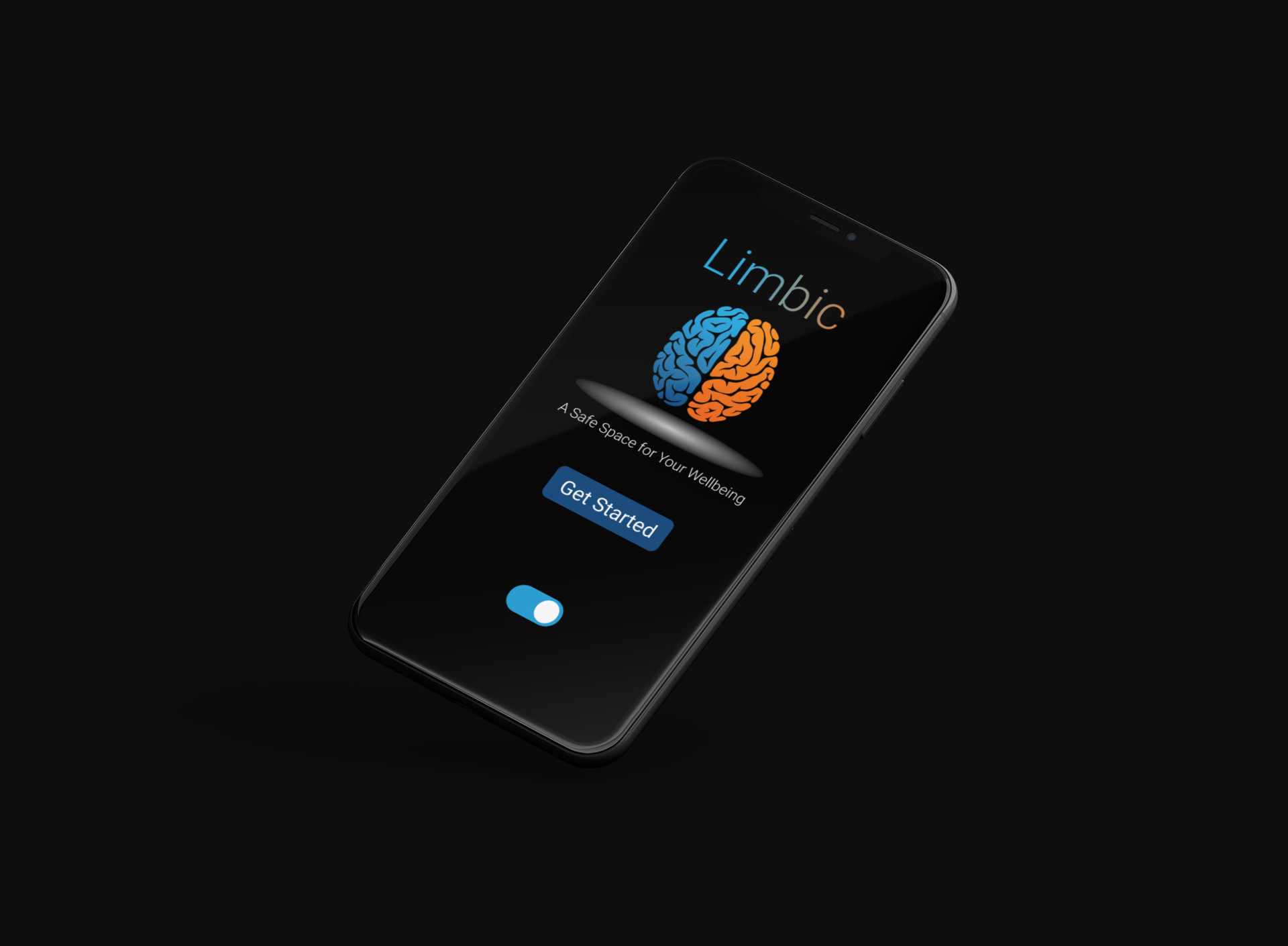
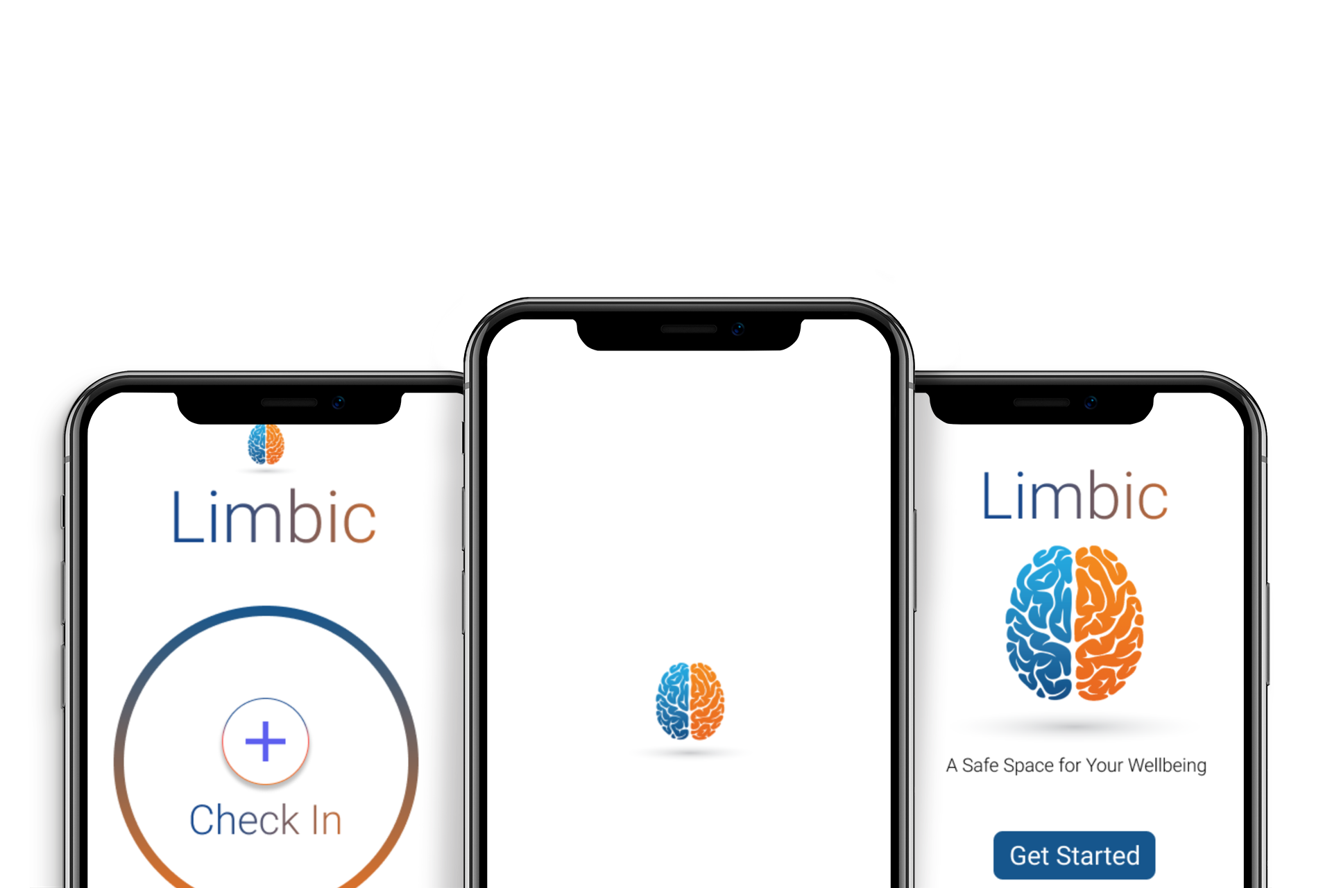
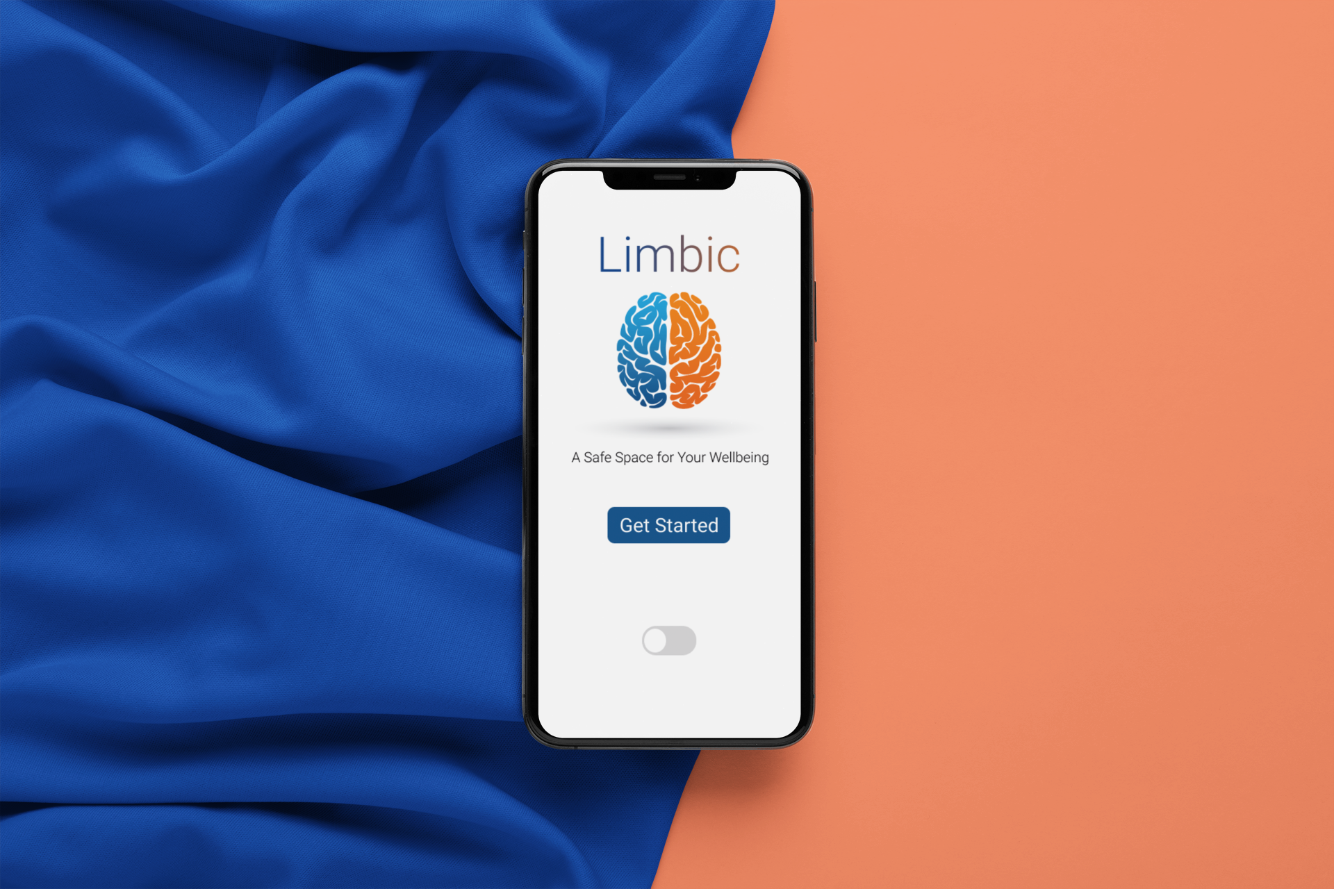
Limbic
Limbic is an emotional wellbeing mobile application that gives anyone ages 16+ a safe space to track, analyze and express their emotions. Limbic strives to be an inexpensive way for individuals to address their mental health by regulating their emotions via the app.
My Role:
UX & Visual Design
Timeline:
4 weeks
Process:

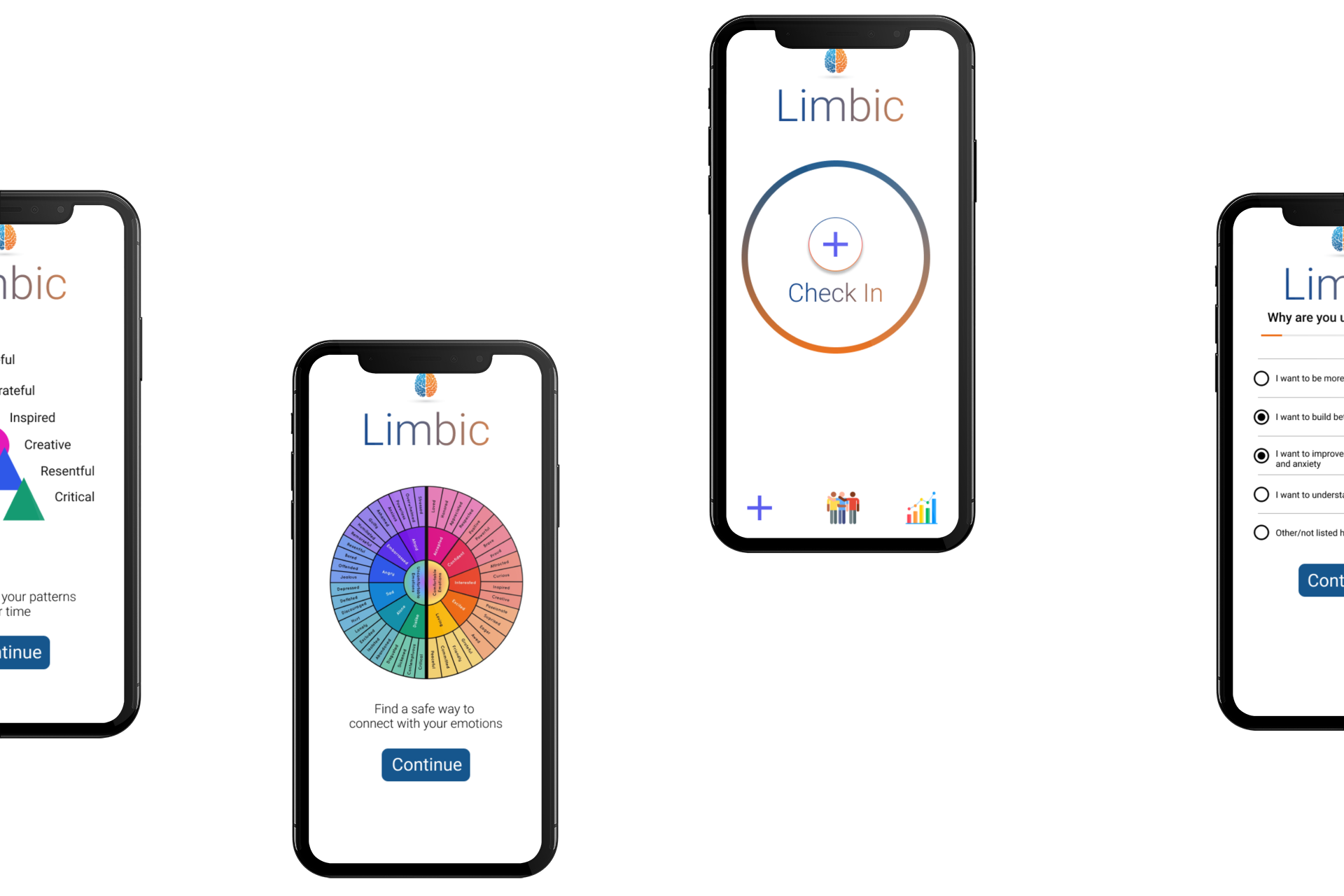
Limbic


Research:
User Research Goals for Limbic: Emotion App
Understand the processes and emotions that users experience around using other emotion apps
Identify common user behaviors and experiences with tasks that an emotion tracker app provides
Understand what culminates in a happy user for an emotion tracker app
User Groups
In my interviews with people who said they were very likely to use an app like Limbic, I was able to identify the following user groups:
Group 1: Working adults who would like a healthy way to address their emotions during a typical Monday-Friday school/work week. These users:
Tend to be overwhelmed with their responsibilities during the week.
Have additional obligations, interests, or challenges that make it difficult for them take breaks
Would use an app to reflect and understand their emotions at the day’s end
Group 2: Young adults who would like an alternative to speaking with others about their emotions or those who wish to take a better handle of their emotions. These users:
Tend to have more emotional needs addressed.
Do not have the ability to access mental health services due to economic circumstances
Would use an app to place orders while they are “on the go” or just at any time convenient for them
User Research Summary
I conducted interviews and created empathy maps to understand the users I’m designing for. A primary user group identified through research were young adults residing in New York who don’t have time to check in with themselves as often as they would like to.
This user group confirmed initial assumptions about Limbic users, but research also revealed that they were open to being able to have additional help with their emotional/mental health. Other user problems included obligations, interests, or challenges that make it difficult to allow them to take breaks or trigger negative emotions frequently thus affecting their overall wellbeing.
Competitive Audit
I picked 2 competitors, which are; MoodNotes - Mood Tracker, a mood tracking app and How We Feel, an emotional-wellbeing journal.
MoodNotes has a paywall after a certain period of usage. poorly-designed website with an inconsistent user flow and a visual design that does not communicate the company ethos. MoodNotes does not allow for multiple check-ins in one day. The website was not designed with accessibility in mind.
How We Feel has a system that is often riddled with bugs with a poor visual design that does not fully communicate the company ethos. The app does not let the user freely express themselves via typing in their emotions. The website was not designed with accessibility in mind.
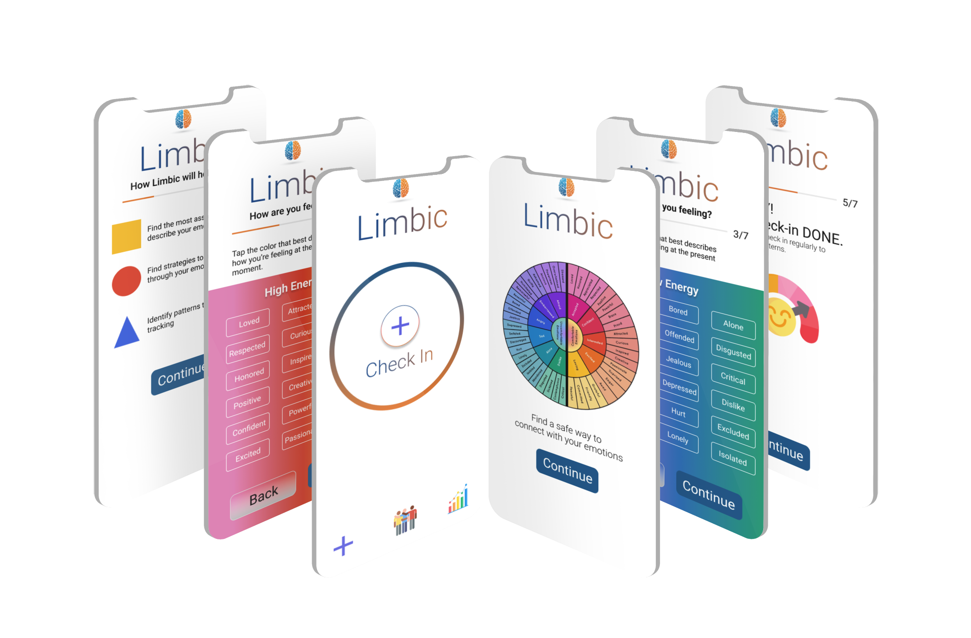
Design Solution(s):
Through my research I have found there is a need for an interface that makes the check-in and starting process easy and seamless for any user.
The solution(s) includes:
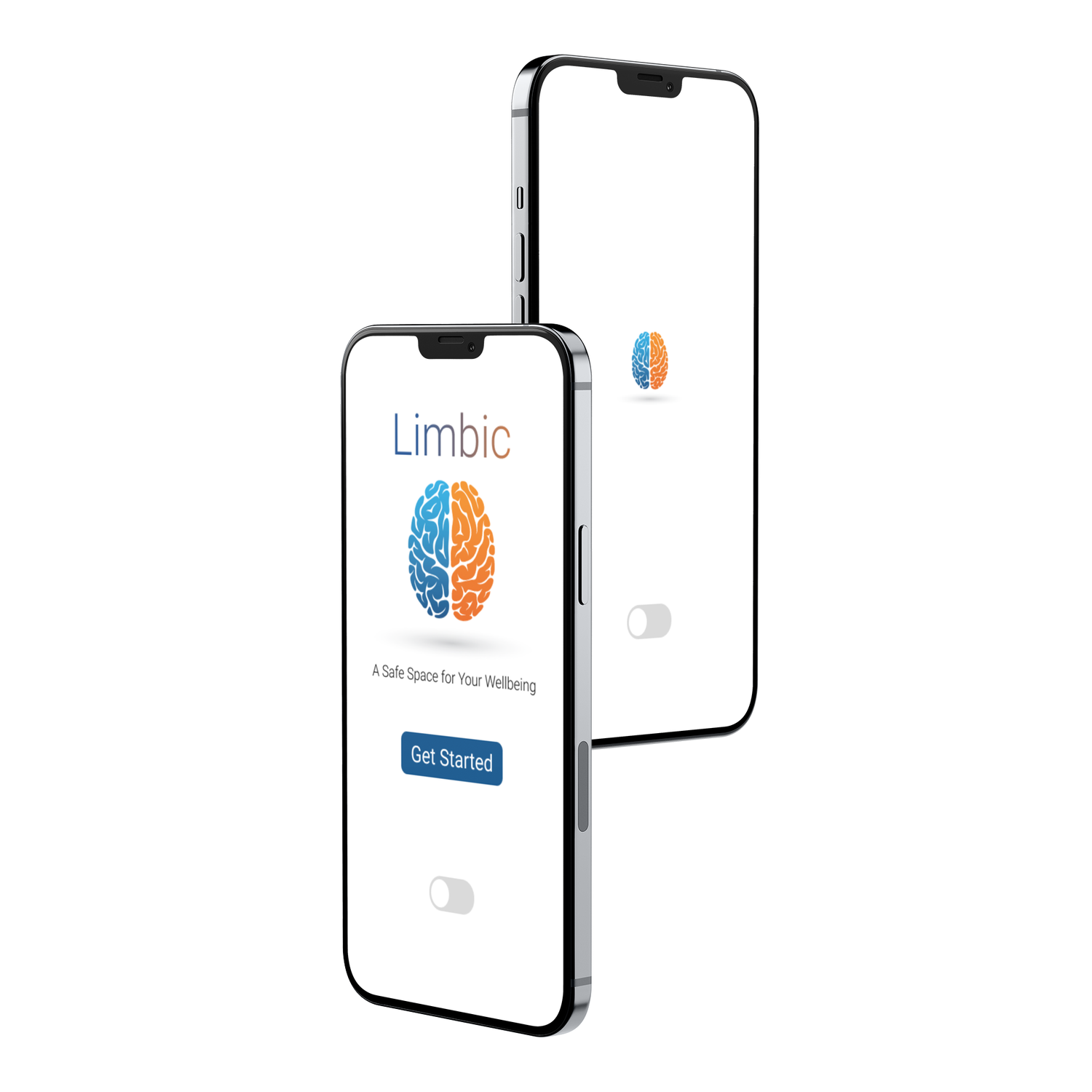
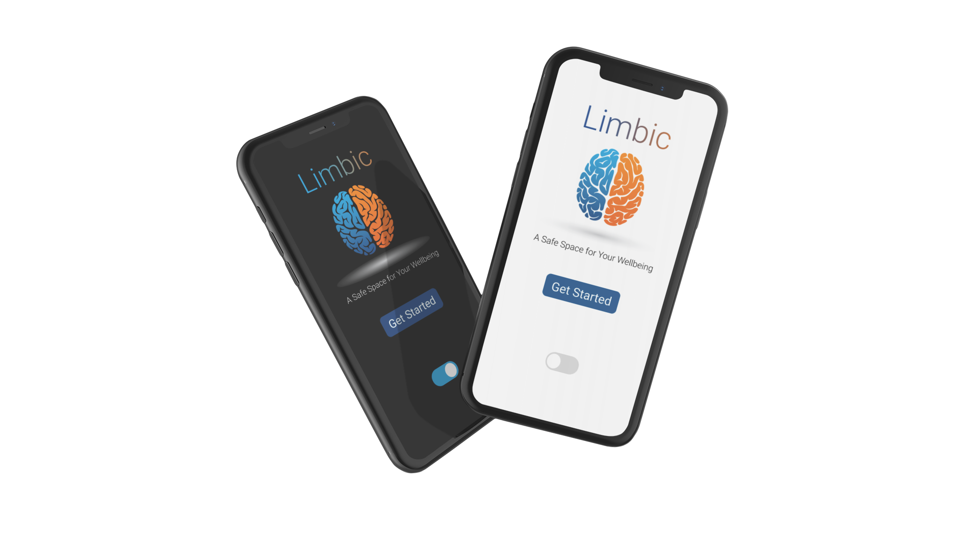
Light/Dark - Designing with WebAIM in mind in providing the option of light/dark interfaces
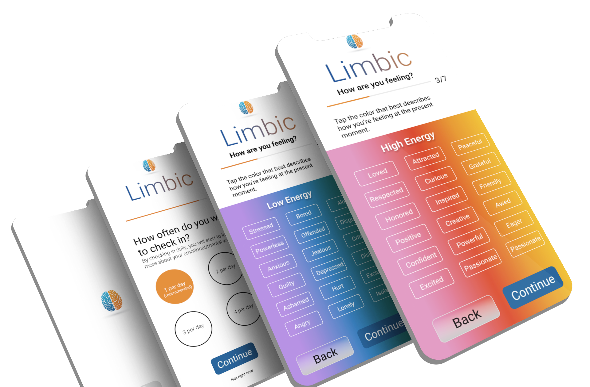
Progress Bar - Helps the user understand where they are in the process
Color Coordination - Connecting color and meanings with words and actions for easy correlation for users
Usability Study
I conducted two rounds of usability studies involving 10 participants whom I chose via a survey.
Study Goal
Determine if users can complete core tasks within the prototype of the Limbic app. Determine if the Limbic app is difficult to use.
Study Questions
How long does it take a user to check in their emotion(s)?
What can we learn from the user flow, or the steps that users take, to check in their emotion(s)?
Are there parts of the user flow where users get stuck?
Are there more features that users would like to see included in the app?
Do users think the app is easy or difficult to use?
Findings from the first study helped guide the designs from wireframes to mockups. The second study used a high-fidelity prototype and revealed what aspects of the mockups needed refining.
Round 1 findings:
For most users, checking in with their emotions was easy
Most users found the payment flow intuitive
Users want to have more resources addressing emotional and mental health
Round 2 findings:
The app’s overall design was appealing
The app’s main flow was easy to complete
The process of checking in was exactly what users wanted
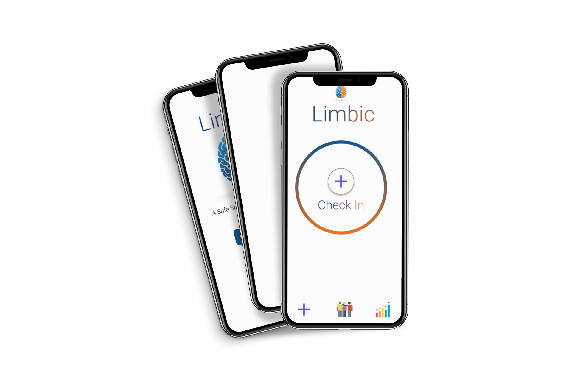
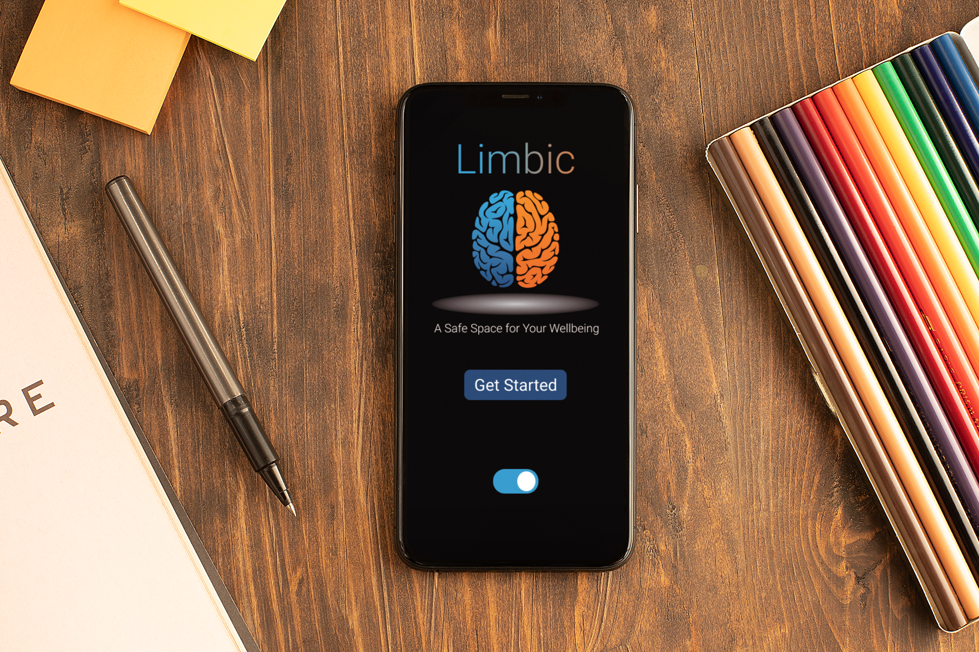
High Fidelity Mockups & Prototype


Accountability Considerations
Designs were made with WebAIM. WCAG standards were strictly adhered to for colour contrast.
Provided access to users who are visually impaired through adding alt text to images for screen readers.
Alternative options were provided for gestures, like; clicking outside and overlay to close it. Used icons to help make navigation easier.
Reflection
I am thrilled with the progress of this project and excited for it's development. While a whirlwind of work, the prospect of me seeing users successfully utilize this emotion tracker app in market is well beyond my expectations.
If there was more time available…
More research, as it‘s a complex and extensive topic with many factors (for example, technical and social challenges) and various stakeholders
Conduct another round of usability studies to validate whether the pain points users experienced have been effectively addressed.
Conduct more user research to determine new areas of need.
Add more features and flexibility backed by research